REDI-Edge
THE STORY
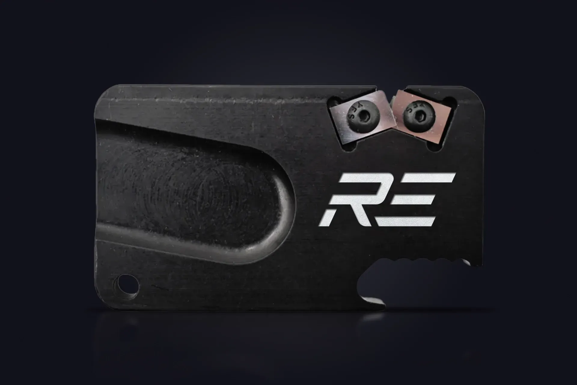
Redi-Edge was a prior product line under Klawhorn industries. They are under new ownership and wished to develop a new version of their brand.
THE PERFORMANCE
The original logo was a curved morph of "R" and "E" in a circle. While widely known, it definitely is dated. The typeface associated is a slab serif, and while that is not necessarily a bad thing, it didn't tie together with the logo in a cohesive manner.
The other component was the fact that this is an American brand making MADE IN THE USA products. What an opportunity to reinforce that fact!
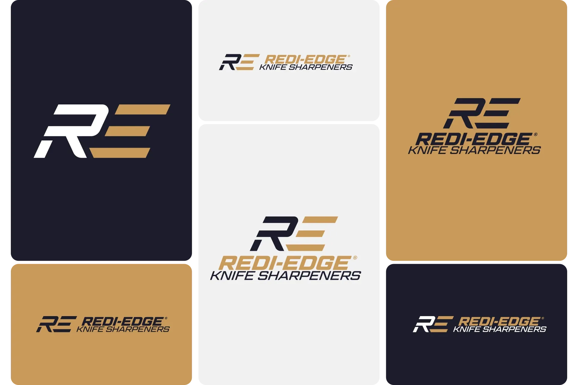
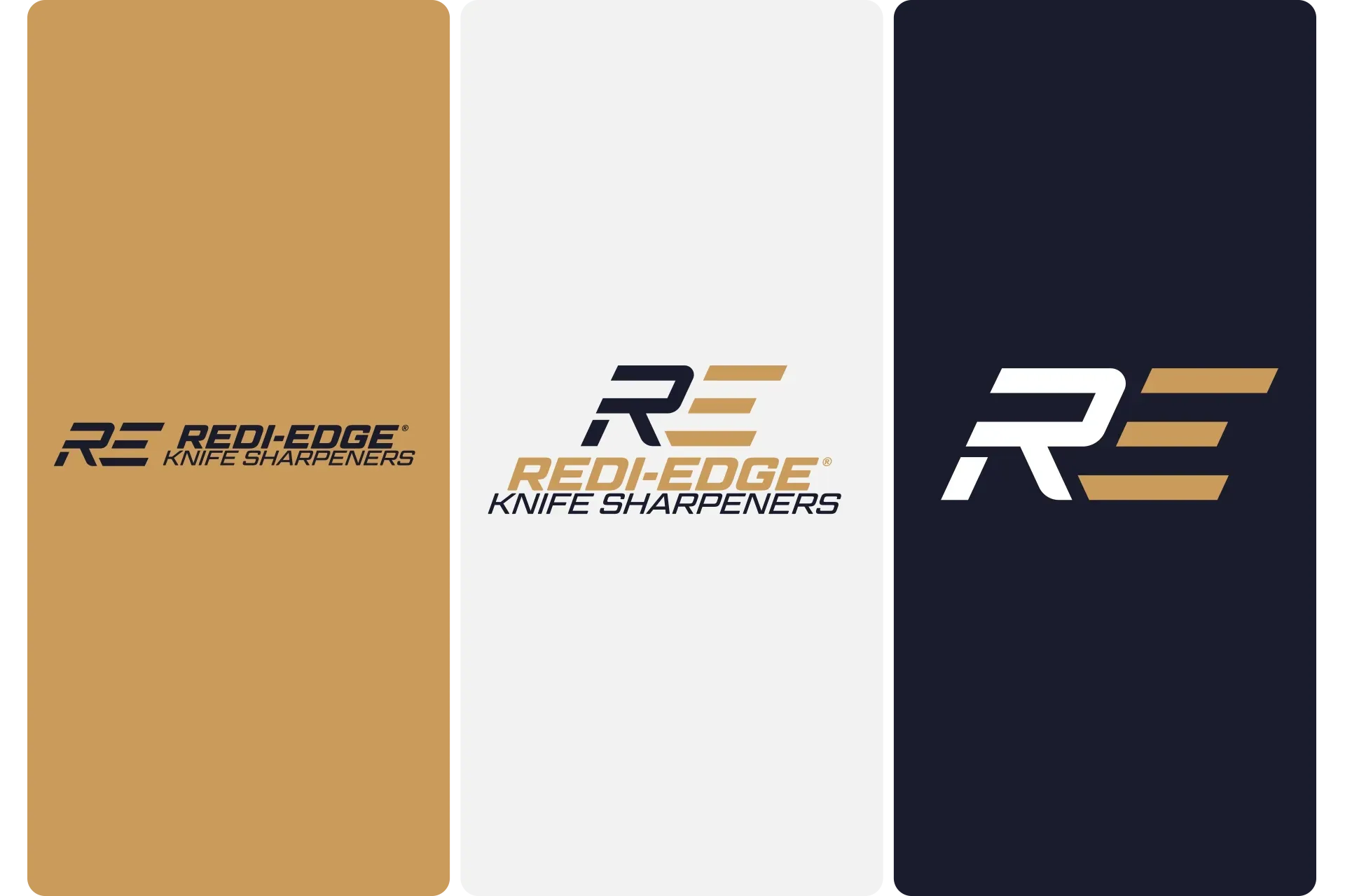
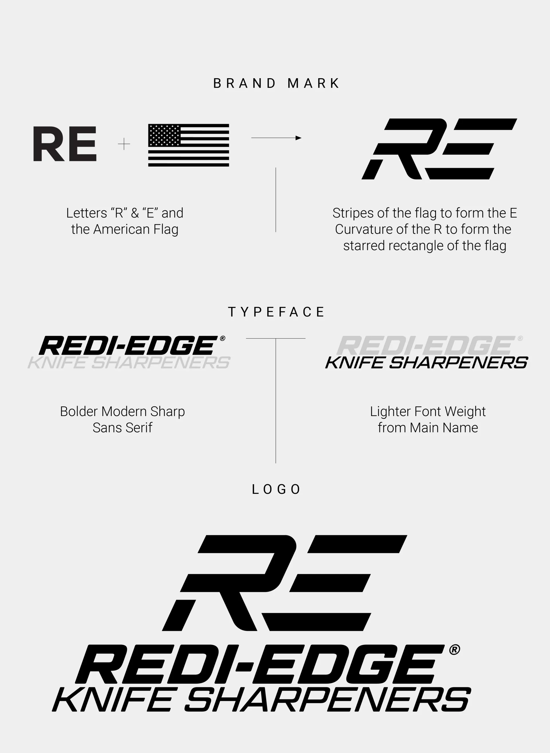
The solution was to incorporate the shape of the American Flag as the "R" and "E". The curvature of the "R" formed the rectangle that houses the stars, while the "E" became the stripes.
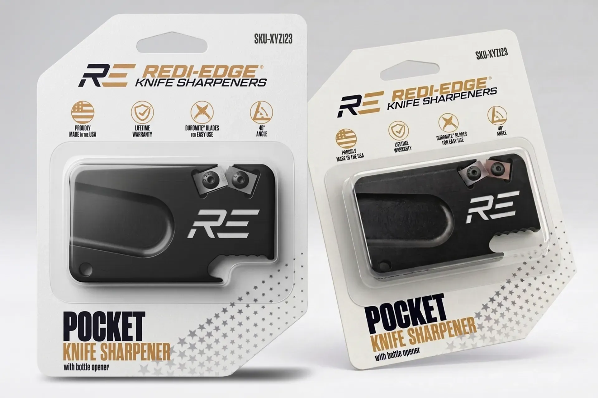
One of the most popular items was the "Tactical" Sharpener, engineered with Duromite blades — a material harder than most steel. We ran with that and chose a stronger-than-steel typeface with different weights that was clean, bold, and tactical.
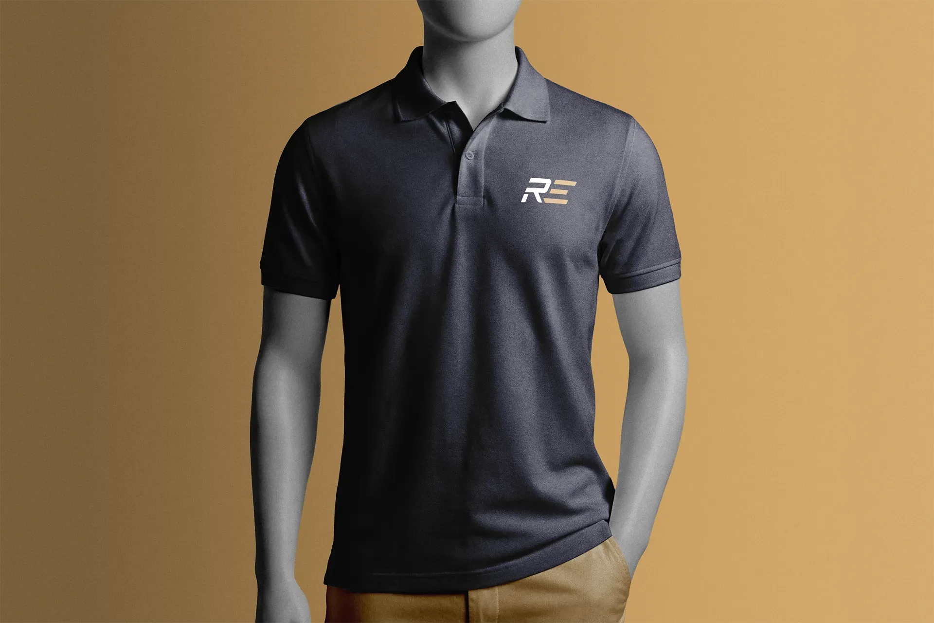
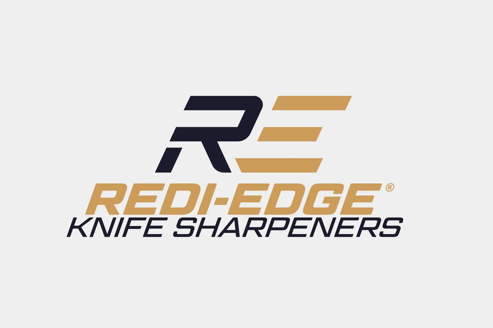
Normally the instinct with wanting to drive home the idea of patriotism is to lean into the red, white, and blue. We chose to take a more elegant approach and lean into a strong symbol of America — the bald eagle. The gold of its beak parallels the darkness of its feathers with the complimentary navy blue. This color palette reinforced the tactical tone.
The result? The requestor decided to do varying shades of gray to allow the color of the product itself to be what stands out on the shelf. This was a different approach that still echoed tactical, but limited the color palette for advertising. We decided to showcase our concept here with the navy and gold, because the ultimate decision was to stick with the original logo and branding since it had market familiarity. This just had to see the light of day since its story ended way too soon.
SERVICES PROVIDED
Logo Design
Rebrand Concept