Knights of Columbus
THE STORY
The Knights of Columbus is the world’s largest Catholic lay fraternal organization. Guided by principles of charity, unity, fraternity, and patriotism, the group originally started as a mutual benefit society to support working-class Catholic immigrants, widows, and orphans.
Every year during lent, (the time between Ash Wednesday and Easter) the Knights of Columbus host Fish Fry dinners on Fridays since part of Catholic tradition is to fast from meat other than fish on Fridays. They also raise money to help many charitable causes around the local area and nationally.
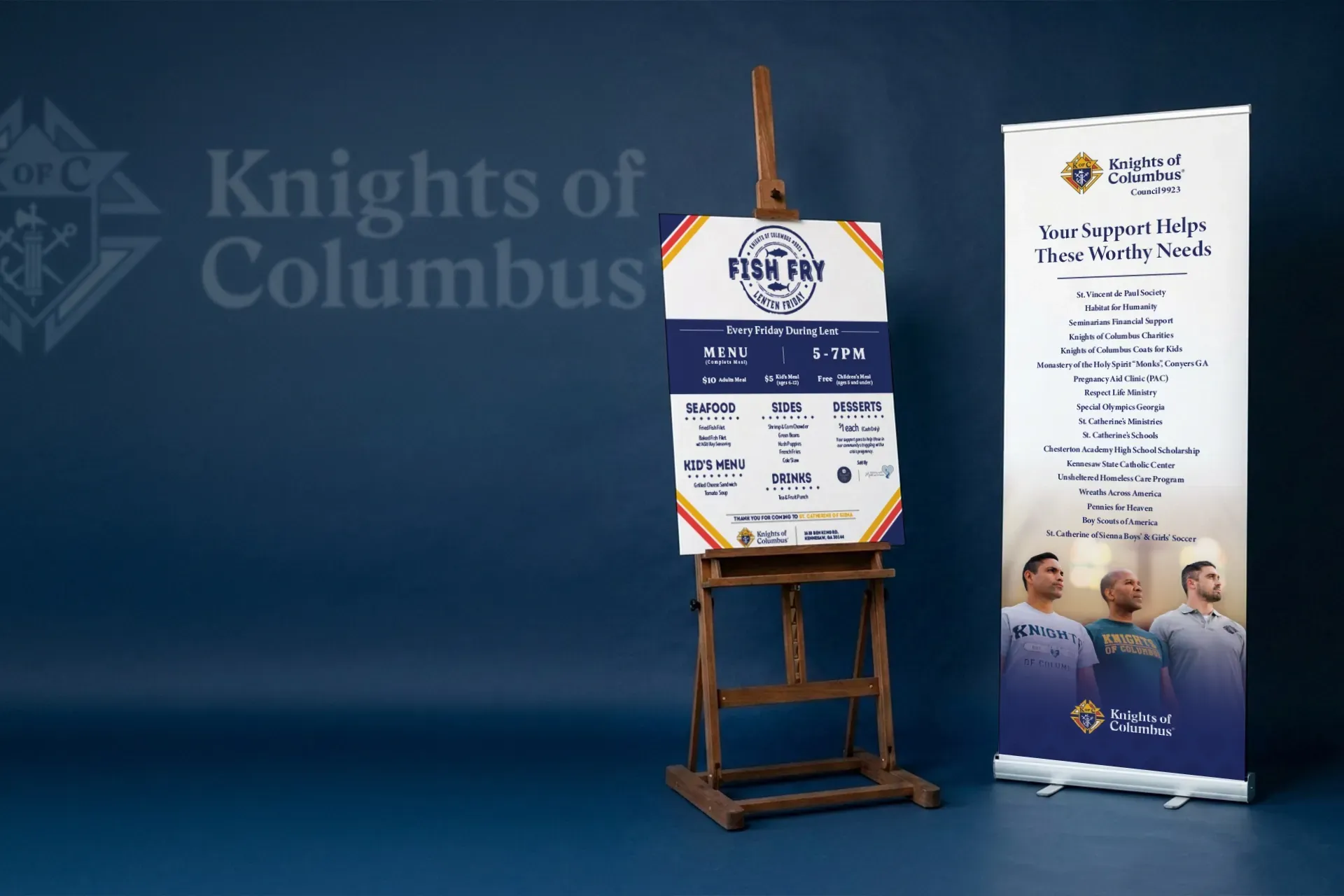
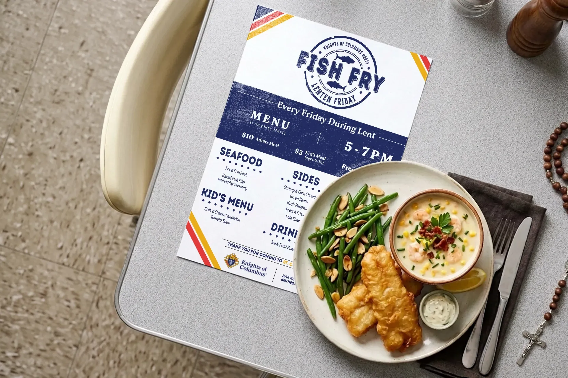
The Council at St. Catherine of Siena Catholic Church reached out to us to help market the fundraising efforts at their events, but also to help design a menu for their annual Fish Fry.
THE PERFORMANCE
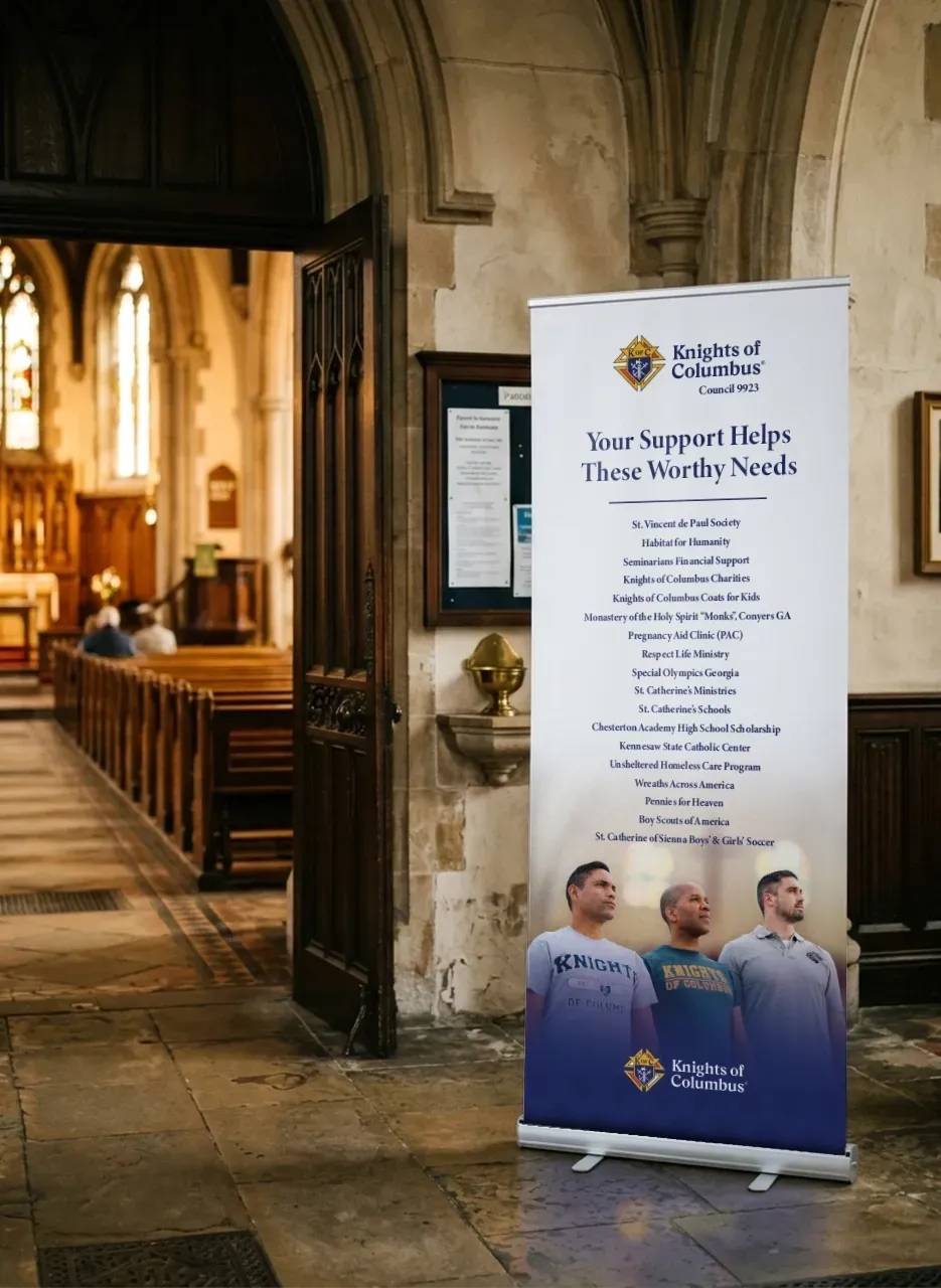
The focus became one piece of marketing collateral to showcase the different organizations the Knights support. A retractable banner was the easiest for set up and tear down, and was lightweight enough to bring to several events back to back.
We ensured the imagery in this featured a younger, but still mature representation of the Knights, along with a holy and approachable feel. These efforts led to several thousands of dollars being raised through our simplified method of visual awareness.
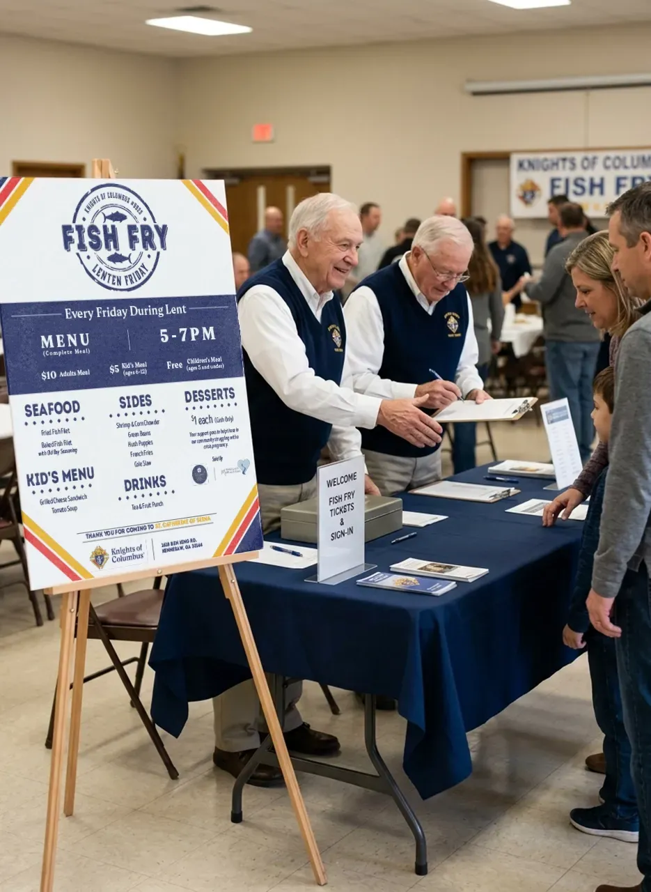
Next came the Fish Fry event. We noticed at other parishes in the area, there were only banners with the words "FISH FRY" with not a lot of creative energy poured into the marketing. Perhaps after years of this, everyone just expects the same old thing. WHAT AN OPPORTUNITY to stand out.
The concept became giving guests an affordable restaurant-type of feel and experience. We started with a logo as all restaurants have, and branded it with typefaces that gave the impression that this is NOT the same old fish fry, but this is a personalized seafood dining experience.
While the budget didn't include a high-end wait staff serving lobster tails, the atmosphere kicked up the desire to up the game of the kind of fish and recipes served. And that is when the lines were out the door!
SERVICES PROVIDED
Event / Menu Design
Logo Design
Banner Design
Printing Services