ECO FLooring USA
THE STORY
Eco Flooring USA came to us for a rebranding concept that would maintain the brand equity they have built up in the years that they have operated, and now bolster a modern iconic look.
THE PERFORMANCE
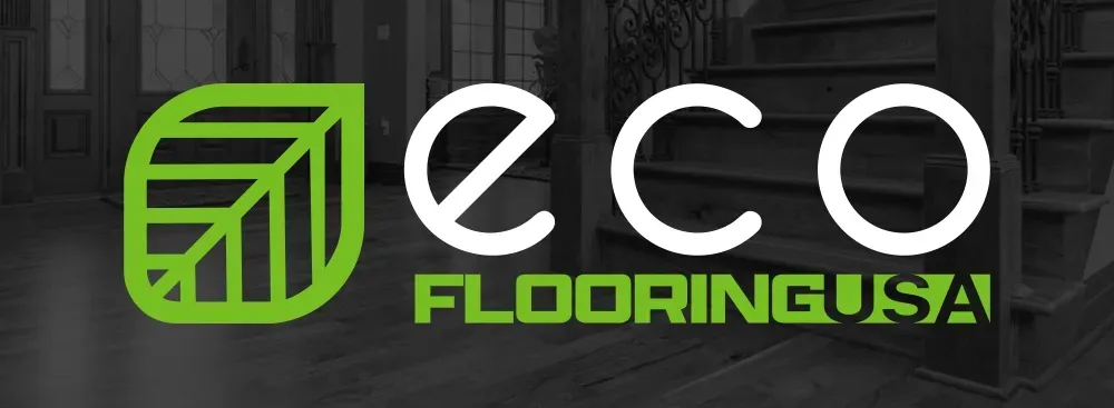
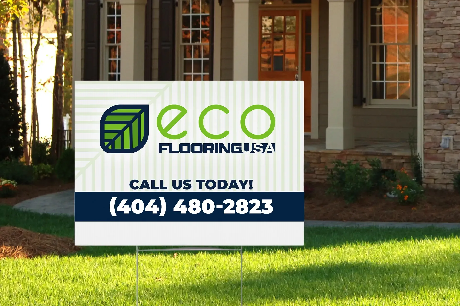
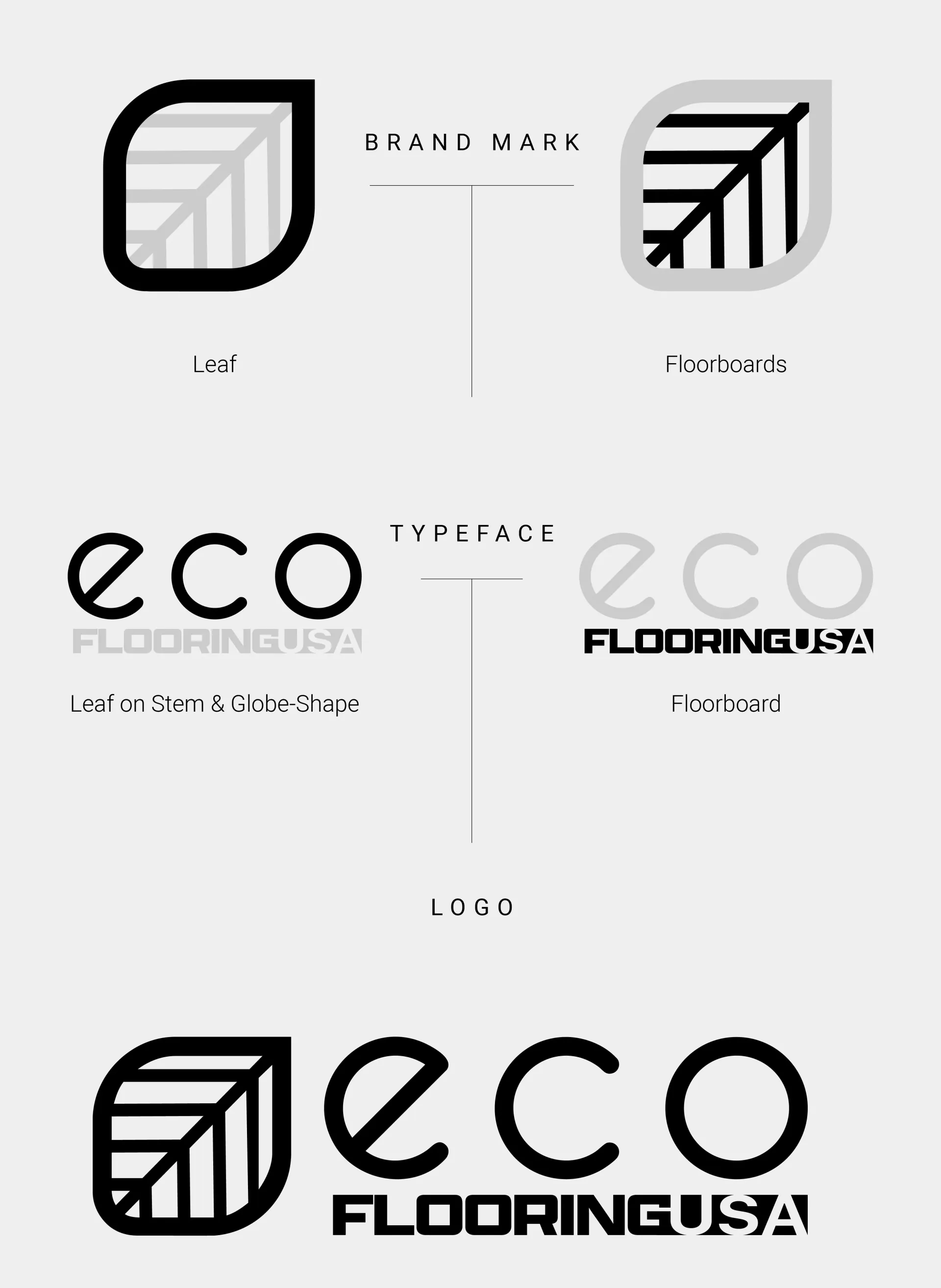
This design combines a leaf with floorboards to boast a modern look to an eco-friendly flooring company. The original logo has a leaf included as the tittle of the “i” in “Flooring”. It was important to keep the leaf since there is brand equity in that as a brand mark.
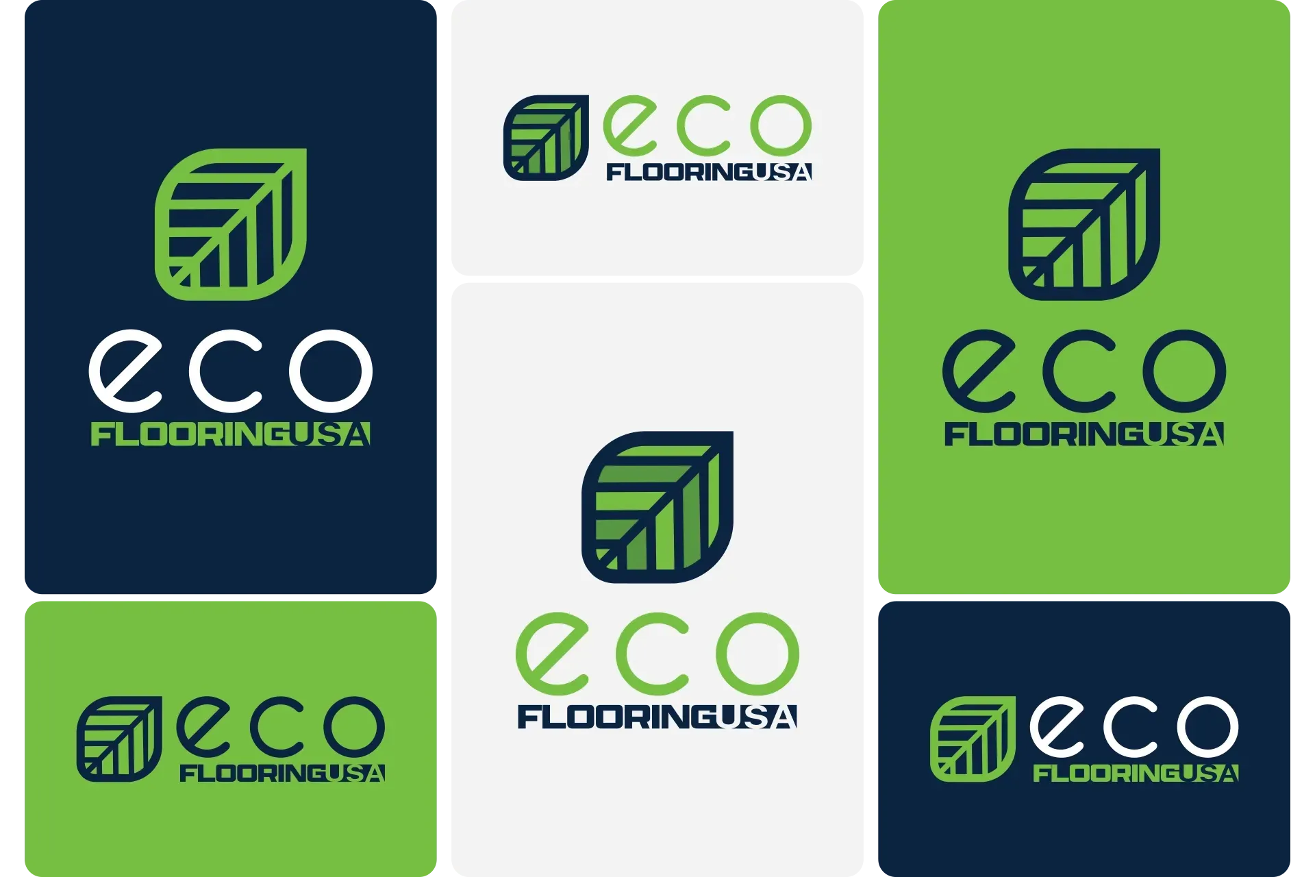
The typefaces were chosen as a combination of futuristic and sturdy. The shape of the letters in “eco” represents the globe, emphasizing a reminder of the global benefit to choosing Eco Flooring USA. The tilted “e” also forms a secondary leaf on a stem shape to more subtly compliment the brand mark.
The “Flooring USA” parts form the overall shape of a floorboard, accenting the primary service and product of the company. In the original logo, the “USA” was connected at the end of the floorboard that stemmed from the “L” in “Flooring. This was another nod to the original logo, just redone to be in a closer association with the product.
SERVICES PROVIDED
Logo Design
Rebrand Concept