Buckhead Young Republicans
THE STORY
The Buckhead Young Republicans serve as one of the strongest chapters in North Georgia of Young Republicans.
After 4 to 5 variations of a logo over the years, they needed new branding to not only advertise their events, but appeal to a dynamic, engaged crowd - essentially winning over the youth vote. We got a hands-on opportunity to transform their look, and set them up for success for years to come.
THE PERFORMANCE
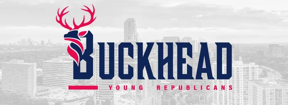
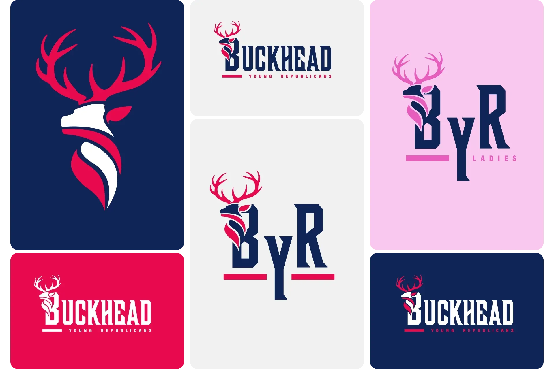
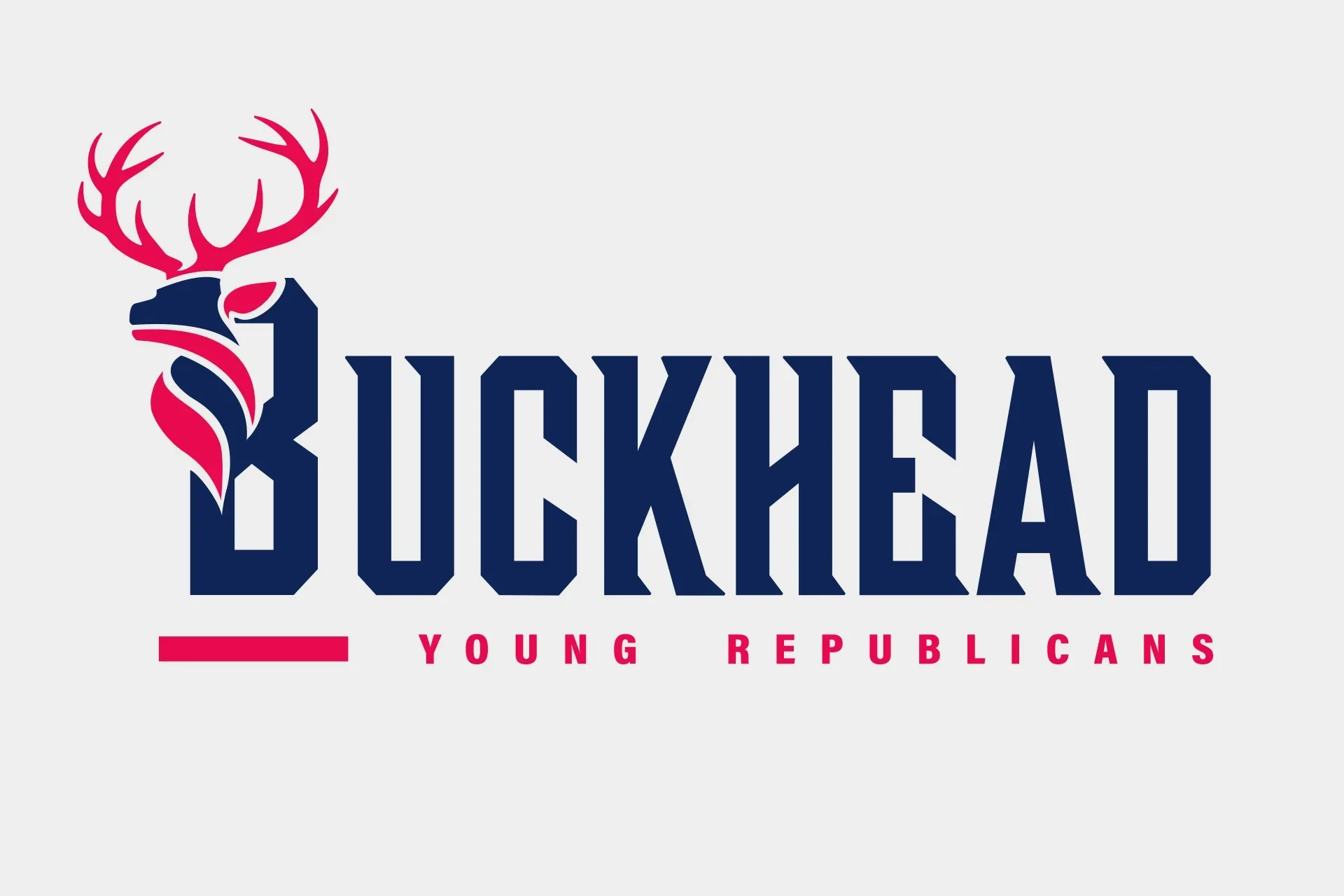
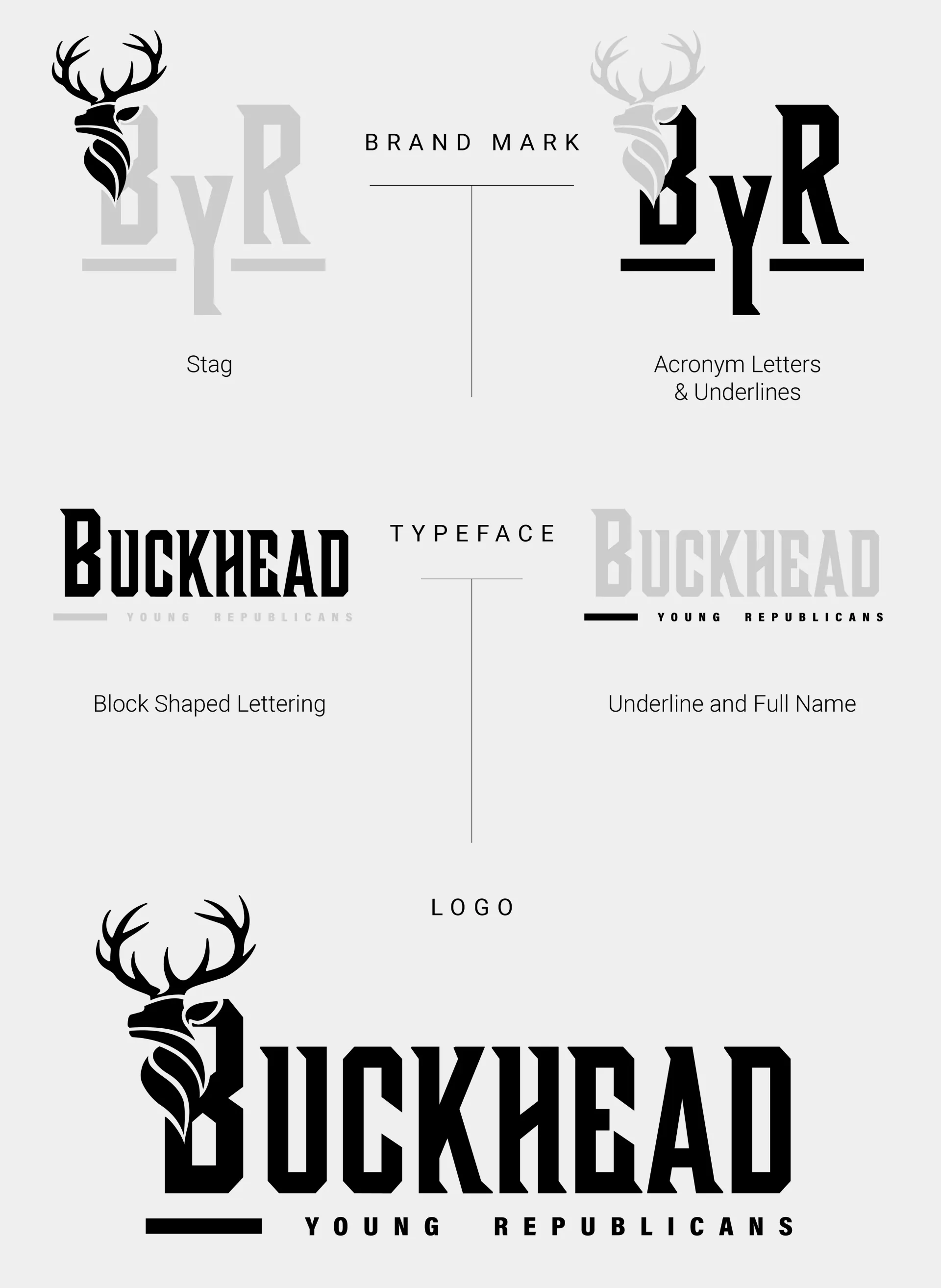
We approached this challenge as if this was a political campaign. The first thing we did was take a look at some memorable campaign logos to weave in a sense of nostalgia. The 2026 Ted Cruz logo served as the main inspiration for the shape of the Buck. His logo was a flame with curved stripes. We noticed that if we flipped the flame upside down, it closely formed the body shape of the Buck.
Next, we wanted to stand out and be bold with the main name of "Buckhead" to make it clear that BYR was a separate group from Atlanta Young Republicans. At the time, there was also a geared up push to establish Buckhead as a separate city rather than a suburb of Atlanta.
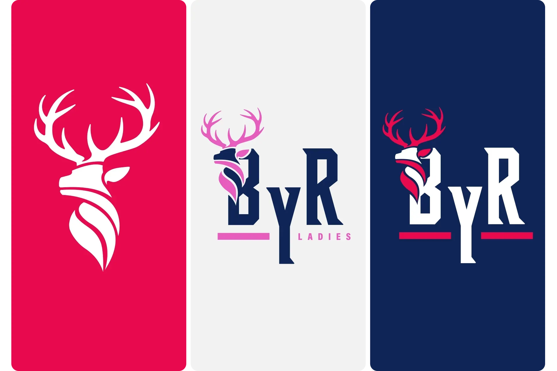
The challenge to establishing this new brand was to showcase this logo in a versatile way as it had many uses. It needed an abbreviated version as most associated the organization by "BYR". The next consideration was that BYR had its own womens' group - the BYR Ladies.
The solution became underlining the B and the R to hammer home that it was Buckhead- and yes there are Republicans in Atlanta. The second underline served as a solid shape to replace with "Ladies" in the alternate abbreviated version.
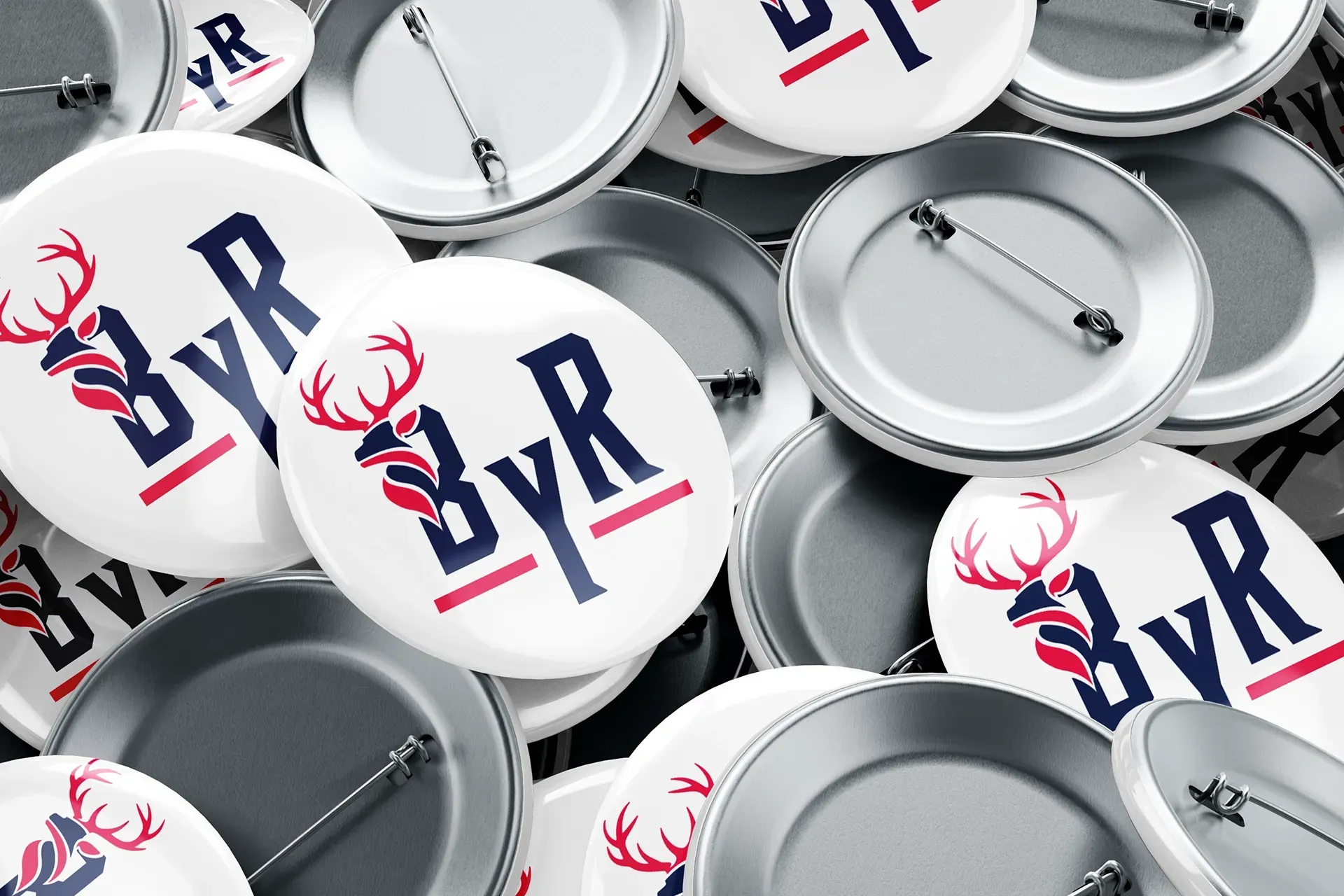
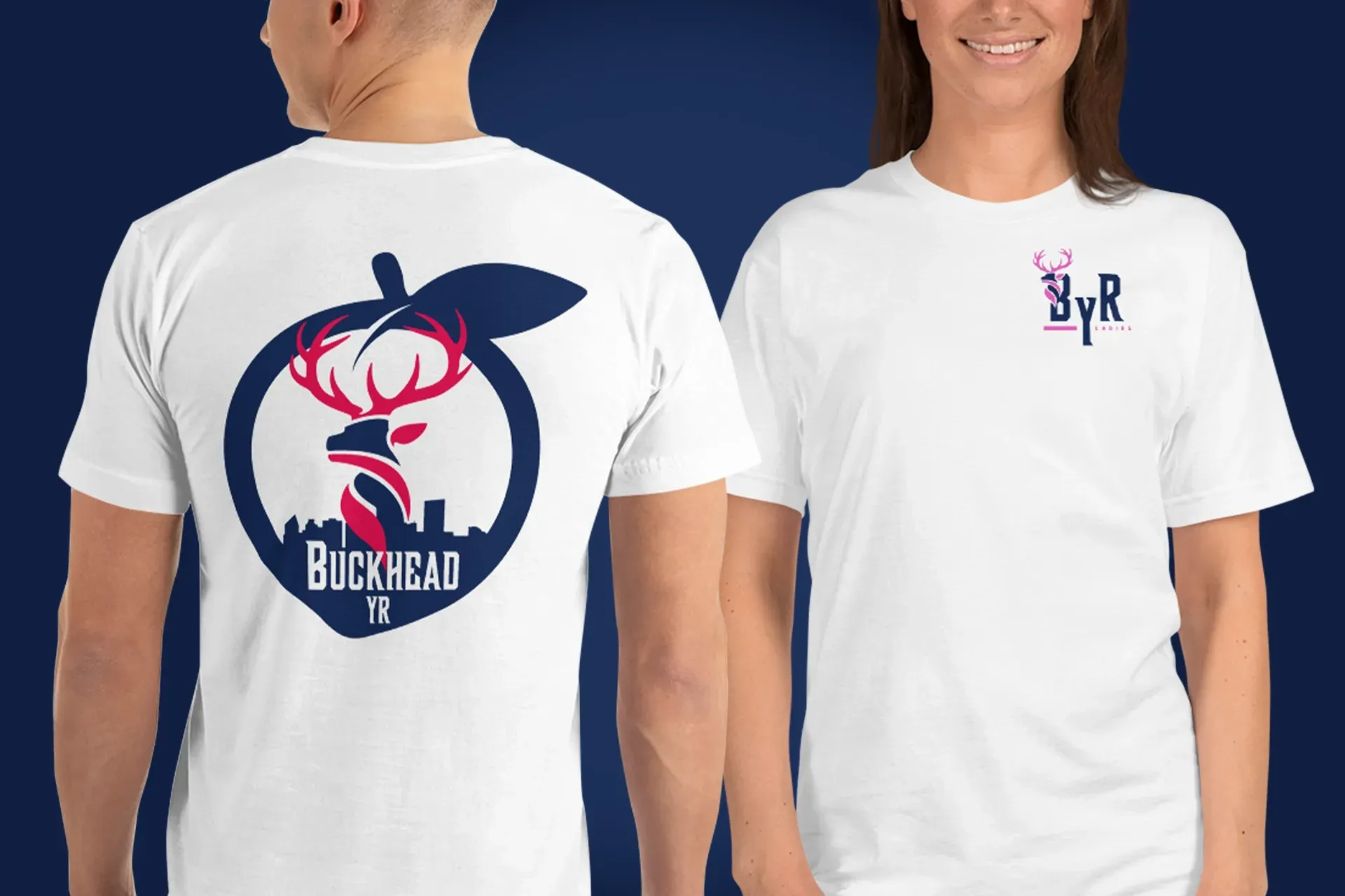
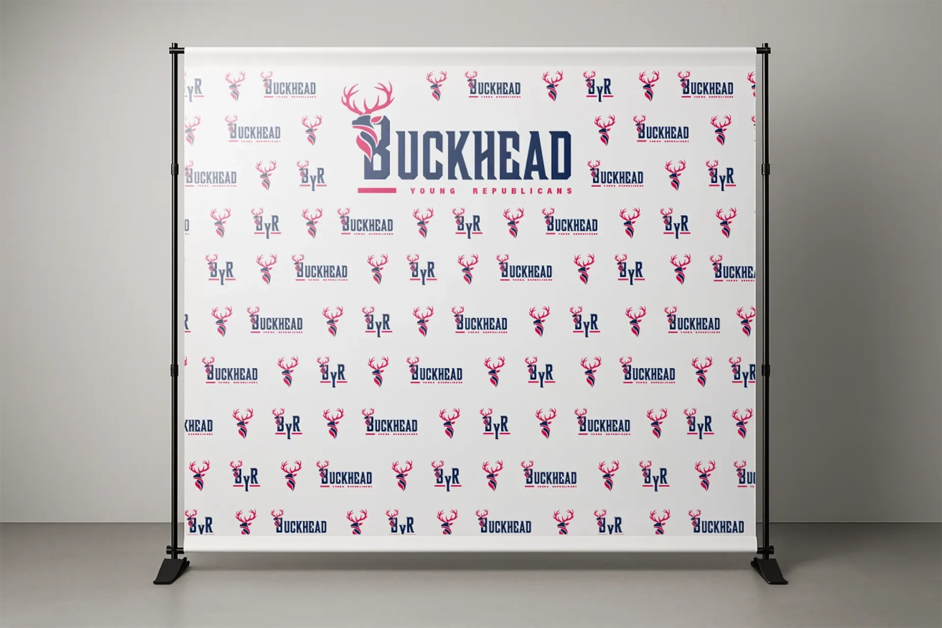
The group adopted the concepts and immediately launched them in various mediums such as a step and repeat banner for their events, t-shirts, and campaign buttons.
SERVICES PROVIDED
Logo Design
Rebrand Concept
Apparel Design
Printing Services