Tachles vc
THE STORY
Tachles VC is a relatively recent Venture Capital firm with a strong connection to Israel. The important pillars that they seek to invest within are Cyber Security, Cloud Infrastructure, and Artificial Intelligence.
They are one of the few great multinational clients we have had the pleasure of working with. Tachles VC was born in Europe, with growth in Israel, and now expansion into America. Their portfolio has already grown and taken off, however they are at the point where they needed a rebrand.
THE PERFORMANCE
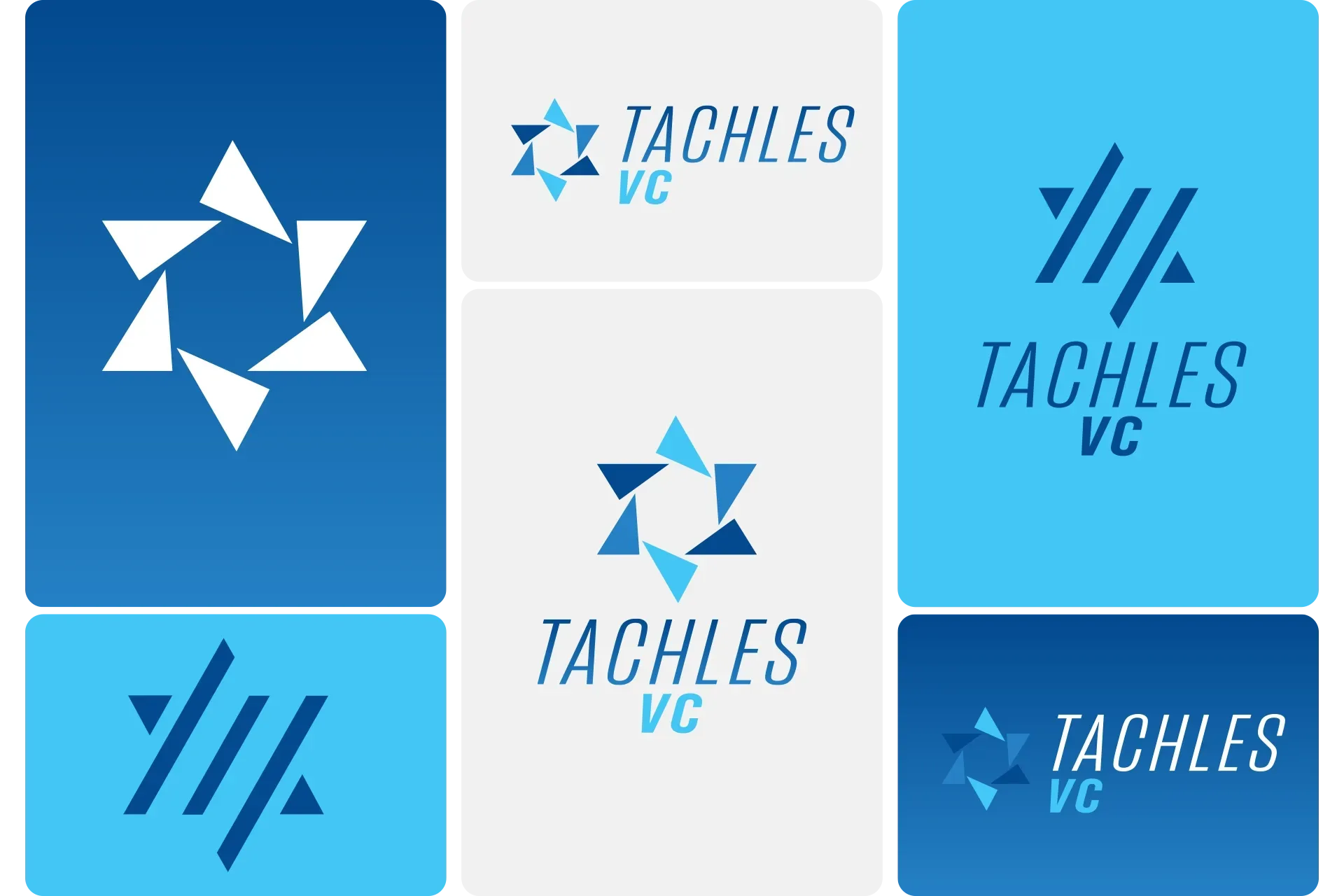
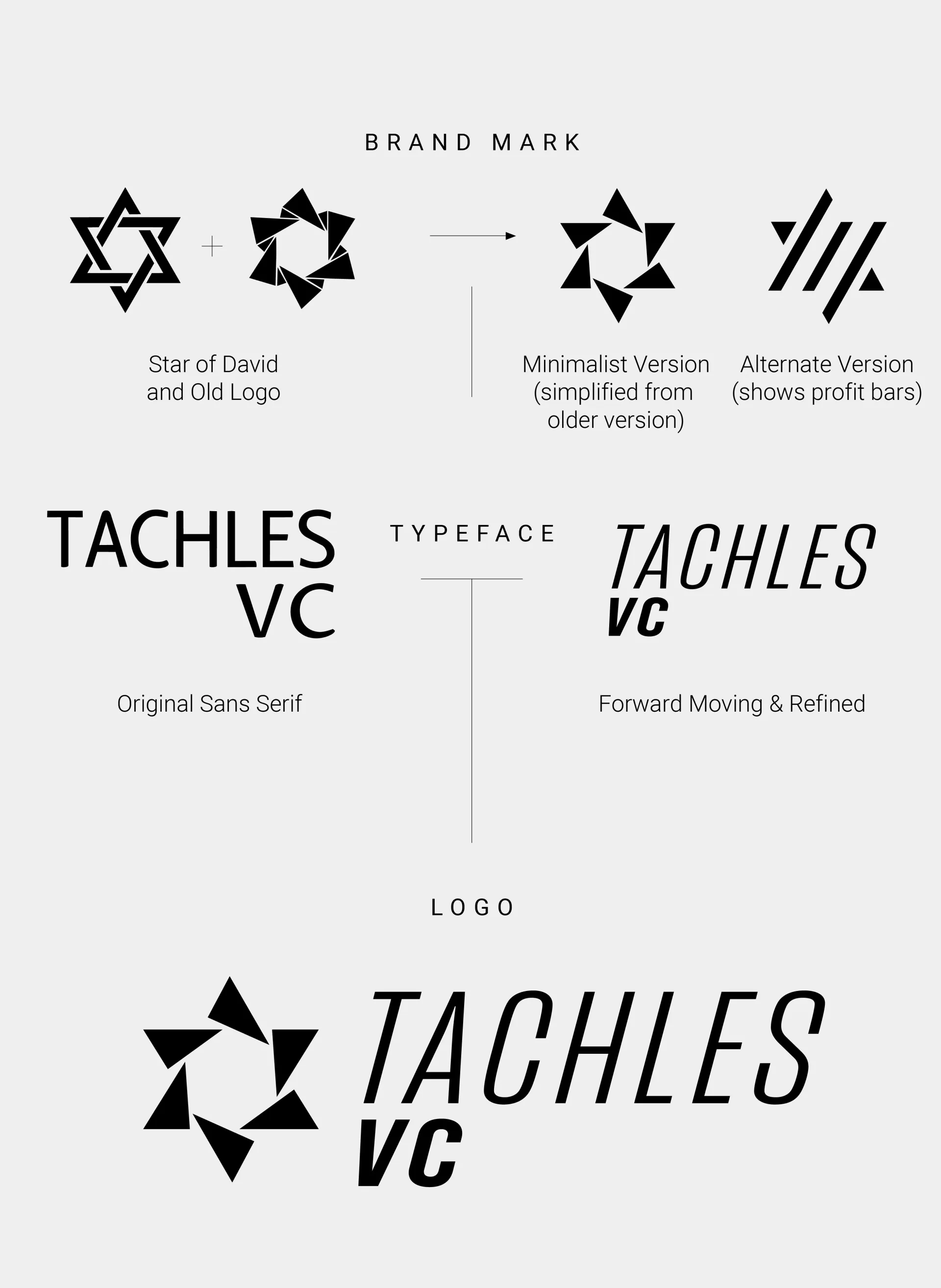
This is where we came in. We wanted to do a soft rebrand of their logo, but more boldly drive home their ties to Israel. The Star of David was a part of their original logo, but our version cleaned up a tad of the clunk of it.
The choice was made to give the name an italicized format to show movement and progress, but it needed to have a font consistent with the type of technological environment Tachles VC operates within.
An alternate version was provided in case they wanted to move away from the triangles. The striped version was a bit more abstract, but presented a ton of branding potential.
The colors used shifted from a red to a more Jewish heritage blue palette. This gave us the rare opportunity to utilize a gradual gradient within the main font and background concepts. The vibrant blues also worked well as they are closely associated with a tech-based ecosystem.
SERVICES PROVIDED
Logo Design
Rebrand Concept